
Quartz anti-aliasing: Jaggies be gone! but at what price?
By Matt McIrvin, July 30, 2002
Feedback Farm
Have something to say about this article? Let us know below and your post might be the Post of the Month! Please read our Official Rules and Sponsor List.
Forums
Want to dig even deeper? Post to the new MacEdition Forums!
[Ed. Note: CodeBitch has covered some of the display properties of various browsers in previous columns. In fact, the rendering quality (or lack thereof) is a major point for some people's browser selection, even over other factors such as standards compliance. In light of this, MacEdition has asked Matt McIrvin to cover the topic of anti-aliasing in a bit more depth in this "Guest Bitch".]
The font anti-aliasing, or smoothing, in Mac OS X is a major selling point, but not everyone likes it, and judgment is so subjective that it's confusing to talk about. The recent release of Mac OS 10.1.5 made things even more confusing – it enabled anti-aliasing for applications that didn't have it before, but also introduced some unfortunate side effects. Here's my take on what's going on, based on my own guesses and observations.
Hints and anti-aliasing
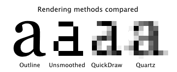
Without anti-aliasing, fonts look jagged on screen, but the system minimizes the jaggies by distorting the character shapes to fit the pixel grid better. It does this with the help of information called “hints” that is contained in the font file. The distortion is especially noticeable at small sizes.
Anti-aliasing fights the jaggies by filling in the notches with gray pixels. This also makes it possible to make strokes that appear to have a width of a fractional number of pixels, by adding gray pixels to the edge of a stroke. In theory, font shapes are freed from the tyranny of the pixel grid. But the illusion isn't perfect – those gray pixels can make the characters look blurry.
Hints can still be useful with anti-aliasing, though. By making the character shapes conform to the pixel grid, hints can reduce the blur that is necessary to anti-alias them. On the other hand, the characters won't look as much like they do on the printed page.
QuickDraw (or, Life before X)
Font anti-aliasing is not new to Mac OS X – it has existed in Mac OS 8/9 for years. The system's QuickDraw graphics code can do it for TrueType fonts, and Adobe Type Manager can anti-alias PostScript Type 1 fonts.
QuickDraw's TrueType rendering uses the hints in the same way, whether anti-aliasing is on or off. So the character shapes end up quite distorted from their printed shapes at small sizes, but the rendering is crisp and readable. The effect of the anti-aliasing is really pretty subtle; some users might not even notice it.
Quartz (or Living on the (fuzzy) edge)
Mac OS X introduced new, more aggressive anti-aliasing for applications that use its Quartz Core Graphics. Unlike QuickDraw, Quartz tries to preserve the character shapes when anti-aliasing is on. To this end, it appears to be either ignoring the hints entirely, or making much subtler use of them.
The effect of anti-aliasing is beautiful and is great for impressing your friends. Specific fonts are recognizable when they're only a few pixels tall. But that blur takes a toll – everything looks a little out of focus, and thin strokes and serifs can look gray.
Is this better or worse than before? I think it depends on the font. Sans-serif fonts with fat strokes look great with Quartz anti-aliasing. Fonts with thin strokes or thin serifs are not so good; strokes can turn completely gray. Reading a lot of this blurry text can be hard on your eyes.
Because of this, anti-aliasing really needs to be turned off at small sizes. In QuickDraw and ATM, there was always an adjustable size threshold; in early Mac OS X versions, it was a hidden preference accessible only through TinkerTool. Later, Apple exposed it by popular demand.
Quartz-in-QuickDraw (or, FrankenRendering)
Most Cocoa applications use Quartz. Carbon applications can use Quartz too (when running in Mac OS X), but most of them still use QuickDraw to render text in application windows. Until 10.1.5, these Carbon apps usually had QuickDraw's TrueType anti-aliasing, with its crisp-yet-unspectacular appearance. That is why Internet Explorer's text rendering still looked just like that of the Mac OS 9 version.
Mac OS 10.1.5 introduced a new possibility: applications could now do Quartz font rendering through QuickDraw, with just a few extra lines of code. Developers immediately started to take advantage of this, and Quartz anti-aliasing showed up in many new places. Unsanity even released a free patch called Silk that would enable this method of anti-aliasing for pre-existing apps. Unfortunately, this Quartz-in-QuickDraw FrankenRendering has new problems that don't exist under true Quartz anti-aliasing.
One problem is easy to see: Quartz-in-QuickDraw doesn't honor the System Preferences size threshold for anti-aliasing, so even very tiny characters will be anti-aliased.
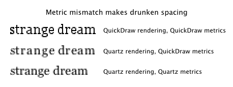
A second problem is that the spacing of Type 1 PostScript fonts can be completely ruined, with characters overlapping one another. This doesn't happen under true Quartz rendering, or with Quartz-in-QuickDraw turned off.
A third problem is subtler. In some applications (some recent pre-release versions of Mozilla, for instance), the spacing of even TrueType characters looks too wide and strangely irregular, especially at small font sizes. This drunken spacing isn't entirely Apple's fault – it's the result of a mismatch between font rendering and font metrics, which are the numbers used by text layout code to determine how much horizontal space to give each character. The presence or absence of hints can change the rendered width of a character by a pixel or two, so QuickDraw font metrics and Quartz font metrics are slightly different. Quartz-in-QuickDraw gives the application author the option to turn on Quartz rendering and Quartz metrics independently. Some developers have discovered that they can make programs go a little faster by only turning on Quartz rendering, with unfortunate visual results.
A mixed blessing
Certainly, Mac OS X's Quartz anti-aliasing is eye-catching. To someone used to blocky Mac and PC font rendering, it looks at first glance like a miraculous translation of the printed page to the screen. By extending the new anti-aliasing to QuickDraw applications, Mac OS X 10.1.5 made it possible to see this glamorous effect almost everywhere. Unfortunately, it comes at the price of blurrier, harder-to-read text, and other anomalies in font rendering. Here's hoping that future releases of the OS and of individual applications can improve the situation.