
What’s up with Steve’s drawers?
By Michael Gemar (michael@macedition.com), 30 January 2001
Let’s face it – although some geek-boys who drink too much Jolt are in a tizzy about Mac OS X’s UNIX roots, the thing that makes a Mac a Mac is the interface. Much has been said about the move to the “lickable” Aqua UI for OS X, with criticism focussing on features of OS 9 that have been changed or left out in Steve’s new candy-colored world. There’s been enough virtual ink spilled on that issue already, and many of the complaints were addressed in the mea-culpa MWSF keynote, so there’s no need to go over that ground here. However, there does seem to be one new feature of the OS X interface that has sat quietly in the background, but which may very well be an important signpost to Apple’s vision of the Mac OS’s future. To see this, let’s take a look at a new document that has quietly been made available from the Mothership.
C’mon, give me a HIG
Apple has finally released a preliminary draft of the Aqua Human Interface Guidelines. I say “finally” because much of the concern around the changes in Aqua was that they seemed to be done without any overarching principles, unlike earlier versions of the Mac OS which always had an HIG document as the guide. That a “preliminary draft” of UI guidelines (which has topic headings with blank sections, no less) is released for an OS past beta suggests that the critics of Aqua may have been correct about its lack of guiding principles in its development. In any case, we now have in our hands the statement of what Apple sees as Aqua’s key functional features, and how developers should adhere to them.
As one might imagine, this document makes for interesting reading for those interested in interface design – in other words, anyone concerned about the future of the Mac. In many instances, it gives an explicit statement of Aqua principles that have so far only been implied. For example, we’re told that controls in dialog boxes should now be “center-biased,” rather than aligned to the left as in Mac OS 9 (p. 114) – which is also the case for the Dock and the departed (but unlamented) Apple-non-menu in the middle of the menu bar. Aqua is obviously big on centering, and now that’s official.
In other instances, though, the Aqua HIG provides relatively new and unexpected information. While I’m sure that various gurus and pundits will deconstruct this document over the coming days, there is one aspect of it that I want to focus on because it describes a new type of functionality in the interface (an addition Apple rarely makes). This new feature of the OS hasn’t really been talked about or demonstrated yet, so at first blush it may not appear to be that important. However, I think this functionality, along with other pieces in the Aqua HIG and recent moves by Apple, may hint as to the bigger picture of where Apple is going with the Mac.
Enter the drawer
Our new friend appears on page 65 of the Aqua HIG:
Drawers
A drawer is a “child” window that slides out from a parent window, and which the user can open or close (show or hide). A drawer contains controls that are tightly linked to the controls in its parent window.
The accompanying graphic gives a feel for what is meant:
A drawer slides out from the side of the window, remains physically attached to the parent window and contains controls that can then be accessed. The panel that slides out looks like a tray, with a thin, slightly raised edge around a lowered surface, upon which the controls appear.
Now, a drawer isn’t a palette, as it attaches to a particular window instead of floating independent of other windows. It isn’t really a dialog box either, although it seems to have much of the functionality of one. The drawer seems to be a wholly new feature of the interface, comparable to the introduction of floating palettes or windoids.
Why drawers?
So what is the appropriate use of this new interface element, according to Apple?
Use drawers only for controls that need to be accessed fairly frequently but that don’t need to be visible all the time. (Contrast this criterion with a palette, which should be visible and available whenever its main window is in the top layer.) [p. 66]
That’s all well and good, but still isn’t completely clear as to why this new functionality is needed, especially when menus or dialogs would do the same thing. What’s it good for?
Well, let’s start by asking a different question: What is it not good for? The short answer is: “Most current everyday Mac apps.” Word processors, graphics apps, page layout packages, etc., are all lousy candidates for drawers. Why? All of these apps presume that multiple windows can have similar operations carried out on them. Actions like changing the font style in a word processor or choosing a tool in a graphics app can apply to any document window of the active app, and so it is more intuitive to have these operations available across multiple document windows. It would be seriously inconvenient to have the position of such window-universal controls tied to the position of each particular window, as it would be with drawers. Because they are independent of where any given document window is, palettes and menus are far more handy – the control you need is always in the same position on the screen, taking advantage of “muscle memory” and enhancing productivity. In other words, if an application primarily involves the manipulation of content in multiple windows, drawers don’t make sense.
One could argue that drawers attached to palettes could be useful, for example allowing a user to easily change tool settings without calling up a further palette. That’s true, but that doesn’t seem to be the use Apple envisions for drawers – they are presented in the quote above as an alternative to palettes, rather than to be used as a feature of them.
No, really – why drawers?
For what, then, could drawers be useful?
Well, to answer that, let me first correct a slight misstatement above. We have seen drawers demonstrated a few times before, including in the interface of QuickTime 4 Player. The fancy brushed-aluminum, one-pane interface for QT Player has a drawer that can be pulled out from the bottom, and holds shortcuts to QT content (be that movies on a hard drive or streaming content on the Net). Given QT Player’s (much criticised) design metaphor, a drawer makes sense. The interface gives the appearance of a single physical object – an “appliance” – and a drawer that slides out from that interface preserves that design metaphor better than a separate palette or window or “Favorites” menu would.
Indeed, using drawers in this manner is explicitly encouraged by Apple:
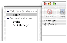
Some examples of uses of drawers include access to favorites lists, access to the Mailboxes drawer in the Mail application [Apple’s OS X mail client], or access to favorites or bookmarks in a browser. [p. 66]
In the Mac OS X Mail app, a drawer “stores” a user’s mailboxes. Again, the idea seems to be to keep the application’s interface physically unified, and to focus almost all interactions with the interface on the single pane, away from the menubar, document windows or palettes.
So, drawers seem to be most useful in those cases where one has a single-pane application, one that doesn’t spawn multiple document windows but where the action is all confined to one window. Like QT Player. Or Mail. Or a browser. Or...
The plot thickens
To add to the picture, we have pictures – or at least a place to put them, as in “image wells,” another new feature of Aqua (p. 112). Image wells are squarish depressions in the “surface” of a pane that can hold individual images that are dragged-and-dropped – and they look an awful lot like the “Favorites” wells in the QT Player drawer. They also look very much like real depression in a real surface.
Another feature of the Aqua HIG is a new design dictum from Apple – namely, distinguish groups of controls through spacing rather than group boxes. An example is given on p. 116. What this principle does is reduce visual clutter that isn’t directly related to a control. The result is less distracting, according to Apple, but it is also more like the grouping of controls on a physical object.
“It’s like, reality, man...”
And this seems to be the point of drawers, and image wells, and banning group boxes – moving the interface closer to a physical analogue. In a recent Ars Technica article, John Siracusa pointed out that Aqua moves away from the explicit “desktop” metaphor to something more abstract. That’s true, but as the author also notes, iMovie and iDVD (along with QT Player) seem to involve a much more physical metaphor. Siracusa argued that these brushed-aluminum, single-pane interfaces were rather independent of the principles of Aqua, but I think it should now be clear that, on the contrary, Aqua very much moves the Mac OS toward an appliance model of applications – one “console”; a pane in which any documents appear (as opposed to separate windows for documents); documents from which trays slide out for frequently-used controls; and with little required use of any control elements that aren’t physically attached to the main console (remember, “Favorites” and “Bookmarks” can just as easily go into a fixed-location menu).
It’s not just that the interface appears more realistic – sure, Aqua has some powerful graphics processing behind it, can do all sorts of fancy tricks and can present more detailed UI elements. But that could have been done with the traditional elements of the Mac OS. What is striking here, and what we have seen with QT Player, iMovie and iDVD, is that Apple is moving toward a vision of appliance-like applications that are perceived and and used as physical objects, with little contact with the rest of the OS UI. These applications don’t spawn window after window across your screen but instead appear to contain almost all the interaction in one physical object. (Also consider that this single-pane mode was, until recently, how the OS X Finder was to operate as well.)
Components everywhere, OS nowhere
Now in a sense, this conclusion is not news, as many folks had similar speculations following the release of QT Player and the similar-looking Sherlock. But with Steve proclaiming that the “Digital Hub” is the strategic direction of the Mac, these interface changes make much more sense. While Mac pros may be comfortable with a gazillion windows and palettes sprayed across their screen, regular folks who just want to edit their home movies, rip some CDs or send some email don’t want or need such complexity. What they require instead is an interface that is simple, intuitive and much like the kind of things they interact with in the real world. In the Digital Hub model, Apple is not appealing to people who are necessarily computer savvy or who want to learn a new metaphor, even one as seemingly intuitive as a “desktop.” Heck, Steve pretty much spilled the beans at the MWSF keynote when he said that the Finder itself will in principle be replaceable by other, simpler ways of interacting with the OS, ways that didn’t involve the necessity of full-blown file access – and an e-mail application was explicitly mentioned. (Now which OS X app from Apple uses drawers and a single-pane?) In other words, a user wouldn’t interact with the OS, but would interact with various stand-alone apps. The OS would become invisible, and the apps would be all the user sees.
In this scenario, don’t think of a Mac as a physical component on the shelf next to the stereo – think of it instead as the container of a bunch of stand-alone virtual components, all looking and operating much like real-world devices. Sure, the much-maligned Cube looks like a piece of Bang & Olufsen equipment; however, the important thing isn’t the steel box itself, but the metal-panelled apps it presents (and is it just a coincidence that the Cube and the TiBook both have the same metallic look as the iApps?). What Steve seems to be pushing is a virtual version of the “Apple Media Player” – instead of a specialized, simplified hardware box, a regular Mac becomes whatever player or media device you need, with each virtual device as simple as a real-world analogue. The drawer is a relatively minor addition to the traditional Mac user interface, but it suggests that the traditional uses of that interface may give way to a new approach to applications, one more compatible with a Digital Hub approach to computing.
Steve, always the master of misdirection, has confused folks by emphasizing the “lickability” of Aqua. It’s not the candy you should pay attention to, but the brushed metal. After all, you wouldn’t lick your stereo.